Veterinary Client Portal App
Pet healthcare is crucial for pet owners. However, today’s veterinary system suffers from pain points such as lack of transparency and overly complicated appointment processes. Finding a new and suitable veterinary hospital is even harder—often requiring pet owners to make countless phone calls for inquiries. Therefore, people need a convenient and comprehensive system that connects users with veterinary hospitals.

Find a vet is complicated…

Pain Points and Solutions
Too many steps to schedule an appointment:
Easy process to search, compare and filter hospitals, and schedule appointments.

Hard to find hospital info:
Access detailed information about veterinary hospitals or doctors, such as educational background and reviews.
Large amount of medical records:
Easily organize and find all records, including medical files, pet profiles, and medication details.

Information Prioritization (Mid Fi)


We explored many different design options for this section, as it directly impacts both the frequency of user engagement and the clarity of the app’s functional positioning. In the end, we decided to feature several functions that users would frequently rely on and want to see at a glance:
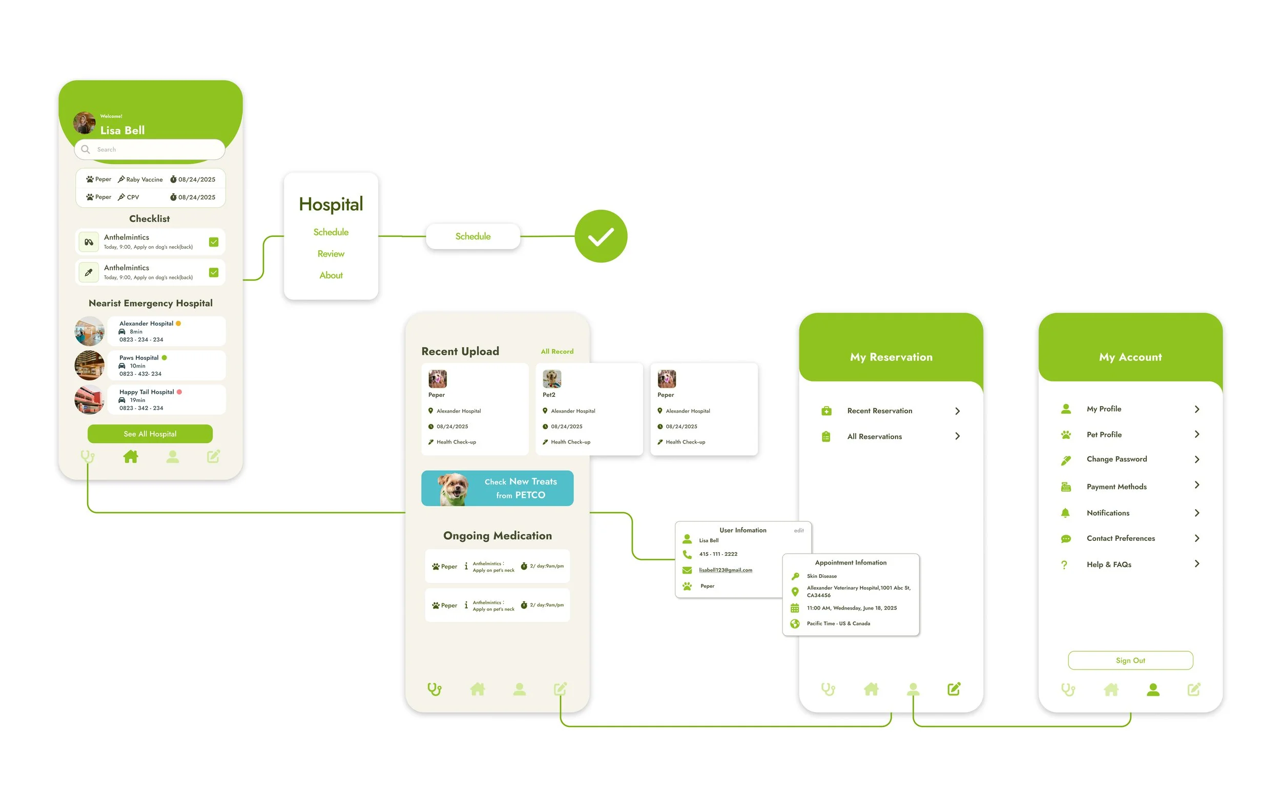
Reminders for Upcoming Vaccines: Long-cycle vaccinations are among the most important yet most easily forgotten tasks for pet parents. Placing reminders at the very top ensures users are reminded every time they open the app.
Checklist: This section displays the pet’s current prescription medications, including the drug name, instructions for use, and dosage schedule. The feature is fully automated — once a vet prescribes medication during a visit, the system automatically adds it to the Home Page as a reminder. From a design perspective, the Checklist not only supports pet care but also increases the frequency and reliance of users on the app.
Nearest Emergency Hospital: In our interviews, many pet parents shared that the moments they most urgently need quick access to veterinary care are during emergencies. Their usual veterinary hospital may not be nearby when an incident occurs, so we placed this function on the Home Page. The section displays three key pieces of information: hospital name, driving time, and phone number. Next to the hospital name, a color-coded dot indicates whether the hospital is currently busy. We believe this small detail can help users quickly identify and choose the fastest option for emergency care.
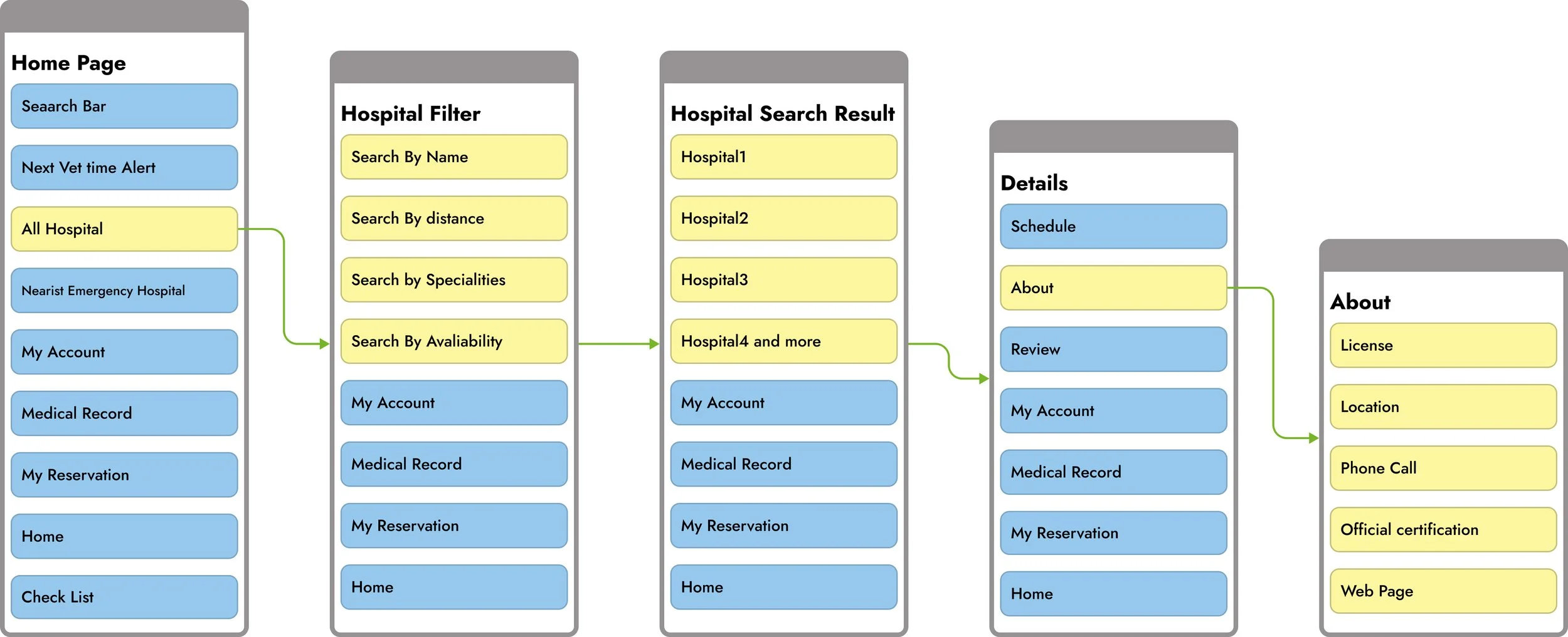
Filter Page
Medical Record
When users click to view all hospitals, the page will automatically redirect to the Filter section. This page addresses most of the users’ needs through customized filtering options. The available filters focus on the aspects that matter most to pet parents:
Location: Flexible location options give users more possibilities. In our simulated scenarios, users may open the app from any location to search for a suitable hospital.
Distance: Selecting a distance radius is a common feature in similar apps. It provides more choices for users depending on their mode of transportation.
Specialties: The diversity of pet species highlights the inclusiveness of this app. This not only provides convenience for owners of less common pets but also creates more employment opportunities for veterinarians with different specialties.

Home Page
This page demonstrates the app’s exceptional ability to organize medical information. Users can not only access their most recent medical records at any time but also view more detailed treatment instructions. With a simple design, the page maximizes user experience.
Recent Upload: This section is the part of the Medical Record that users are most likely to browse. The swipe-right function adds flexibility for users with more than one pet. While older records may not be frequently used or referenced, users can still access them anytime by clicking the button in the upper-right corner.
Ongoing Medication: More detailed treatment instructions are displayed in this section, providing users with clear and structured information on their pet’s ongoing care.
High Fi Design
In the UI design, I adopted the use of large rounded corners. This greatly reduces the rigid and cold impression that a medical app might give to users. The curved background design also brings a “nature-inspired” visual language to the interface, aligning with the gentle positioning of a pet healthcare app.
The card components enhance the hierarchy of the page, and their inherent rounded corners blend seamlessly into the overall friendly atmosphere. This not only retains a sense of professionalism but also adds warmth and trust.

Home page and Hospital Selection
Sign in Section


Setting Section
Medical Record


Check my Reservation

Schedule Process
Check to see All creative process At my Figma file:
Check the Prototype(animation) at Figma:
https://www.figma.com/proto/m2ZkGwSpuGwZH4iHcEE4ym/-Vet-Pet-Hospital-system-Design?page-id=29%3A60&node-id=145-2584&viewport=27%2C401%2C0.07&t=pJNo2rEFM0v3M5QY-1&scaling=scale-down&content-scaling=fixed&starting-point-node-id=145%3A2584&show-proto-sidebar=1