Network Configuration
Configuring network connectivity in an enterprise data platform can be complex, especially when users need to manage multiple network settings, understand technical requirements, and troubleshoot configuration issues. During my internship on the IBM watsonx.data team, I worked on improving the Network Configuration experience to make this process more understandable, efficient, and consistent for users working with enterprise data infrastructure.
The project focused on understanding the existing configuration workflow, identifying usability and information-architecture challenges, and translating complex technical requirements into a clearer user experience.
Product: IBM watsonx.data
Tool: Figma
Focus: Enterprise UX · Network Configuration · Information Architecture · Interaction Design
Team:
1 Design Lead
2 Designers
3 Software Engineers
1 Product Manager
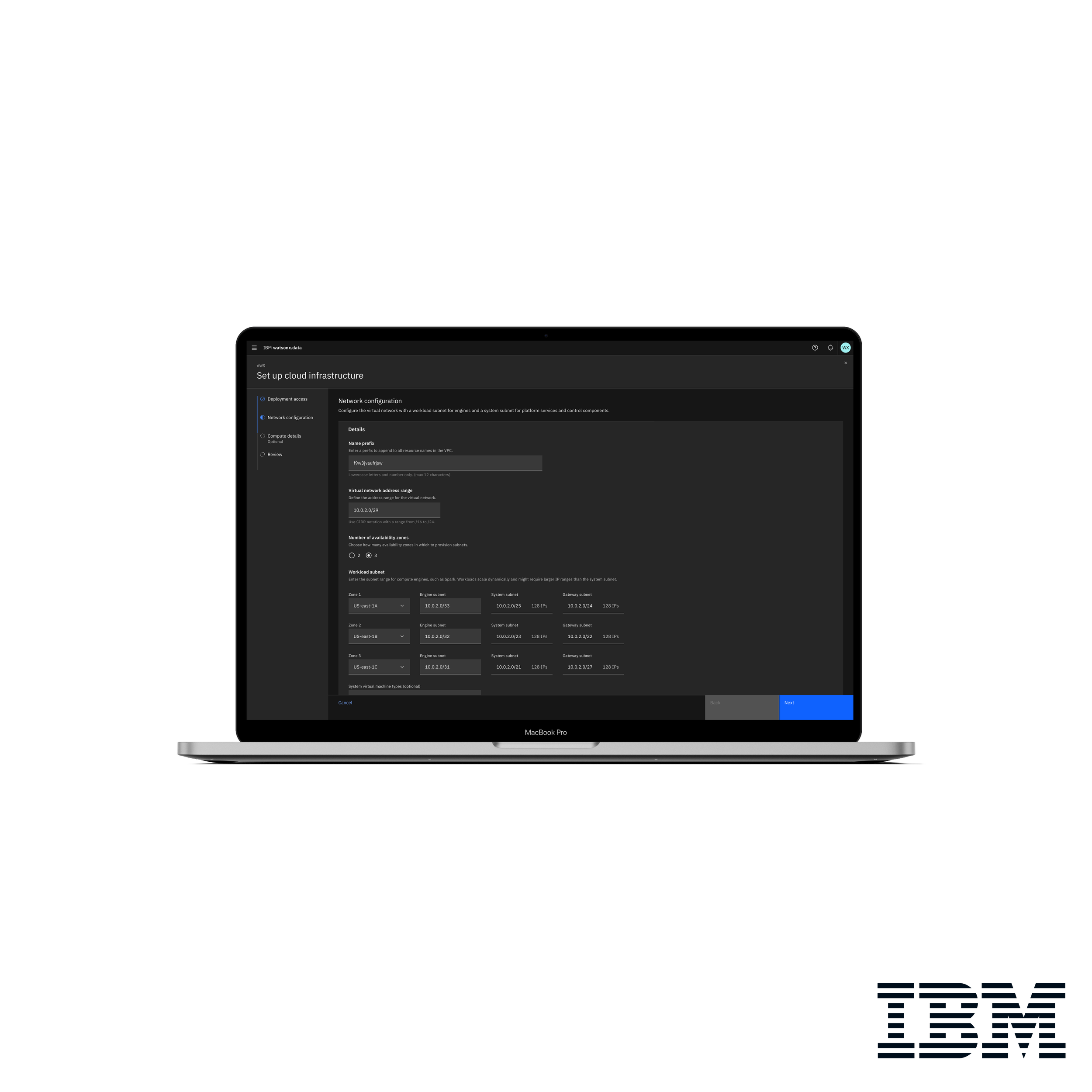
Different Zones
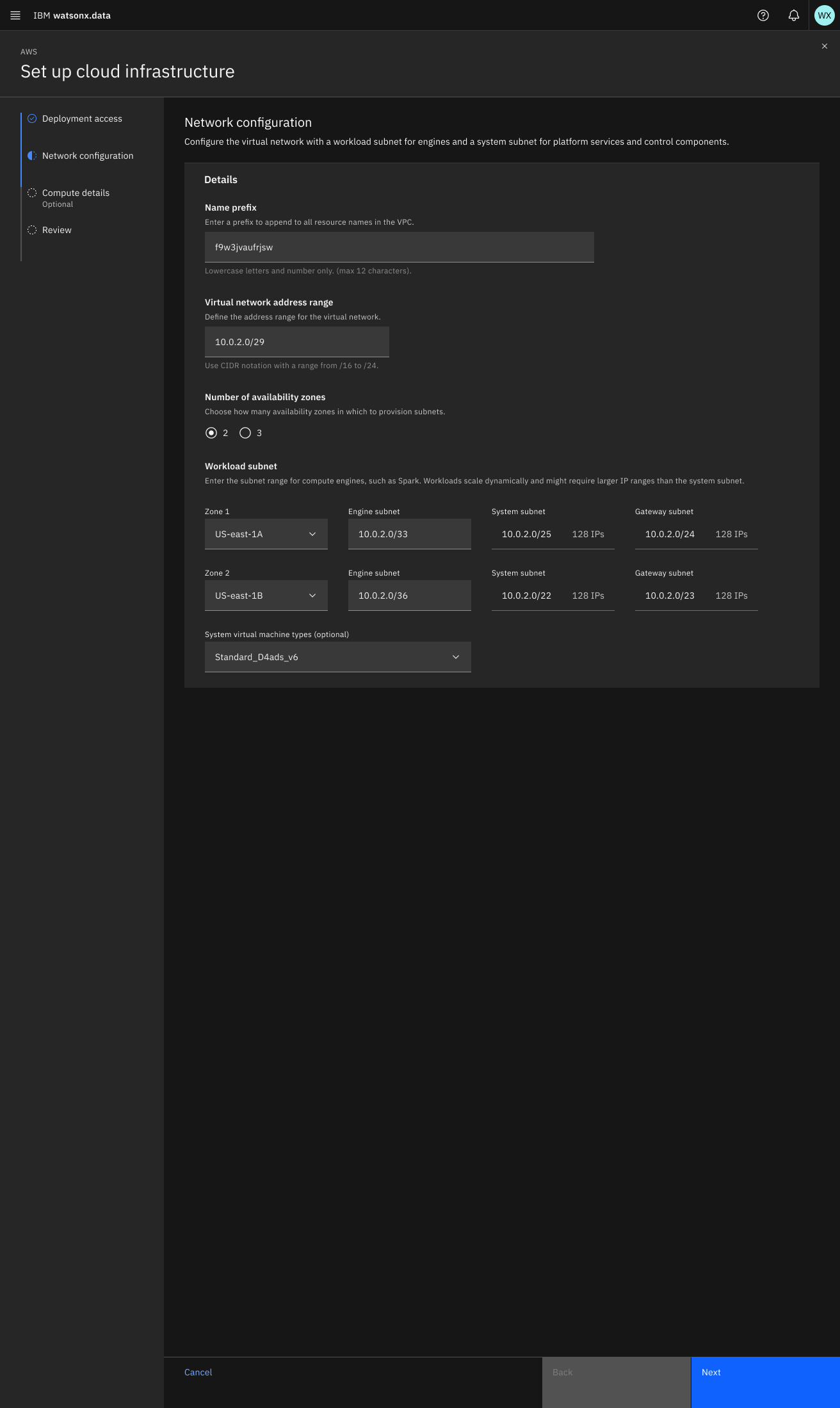
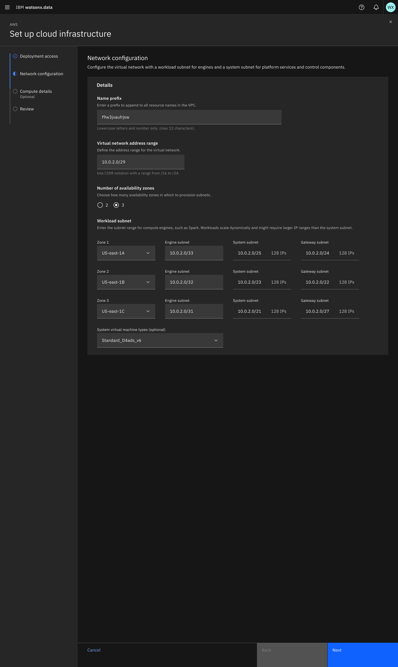
I explored two approaches for the Network Configuration experience: a two-zone layout for a simpler structure, and a three-zone layout for clearer separation of configuration and supporting information.
Process at Figma
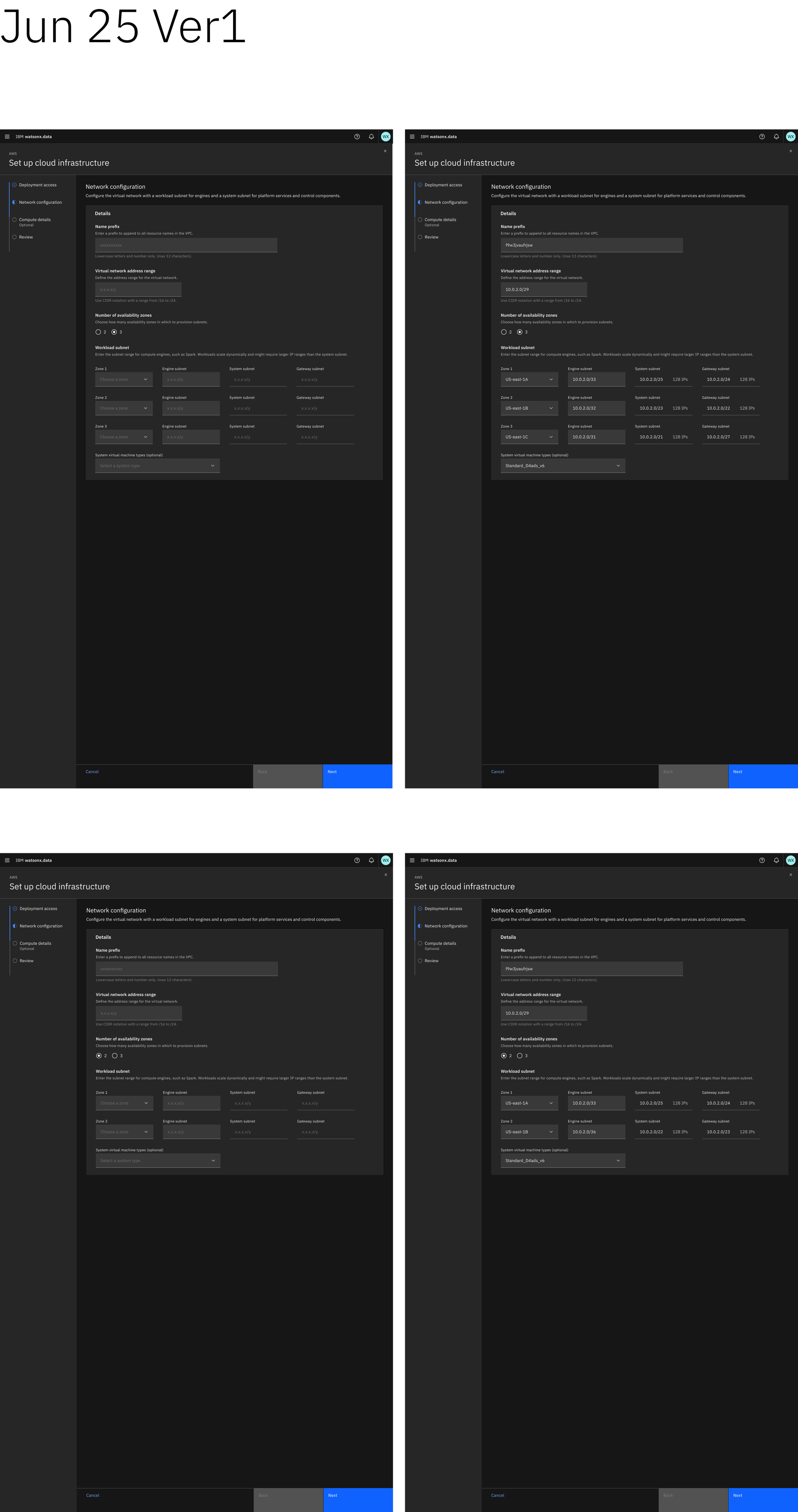
The following shows my design process and iterations:
This first version was based on the Design Lead's direction. The top row shows the same page explored with two different zone configurations. The designs were still being refined toward IBM's layout standards, including input-field styling. The second and third rows show interactive explorations created with Figma Make. These experiments helped me explore additional possibilities for the feature while learning how Figma Make could support rapid interaction exploration and prototyping. The exploration provided a strong foundation for the final design.
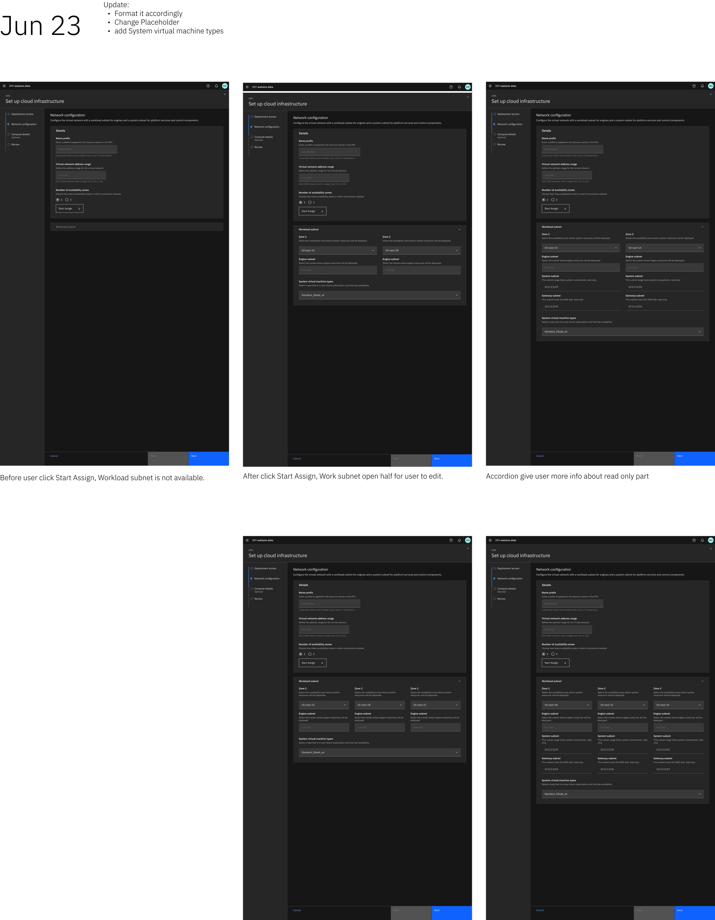
The final version presents both the empty and completed input states in the first row, followed by the two-zone layout. The biggest change was how input fields were visually differentiated. Previously, all fields used a light-gray background regardless of whether they were editable, which could encourage users to interact with fields that were intentionally non-editable. I introduced two distinct background treatments to clearly differentiate editable and non-editable fields. Other visual elements and interactions were also standardized for a more consistent experience.
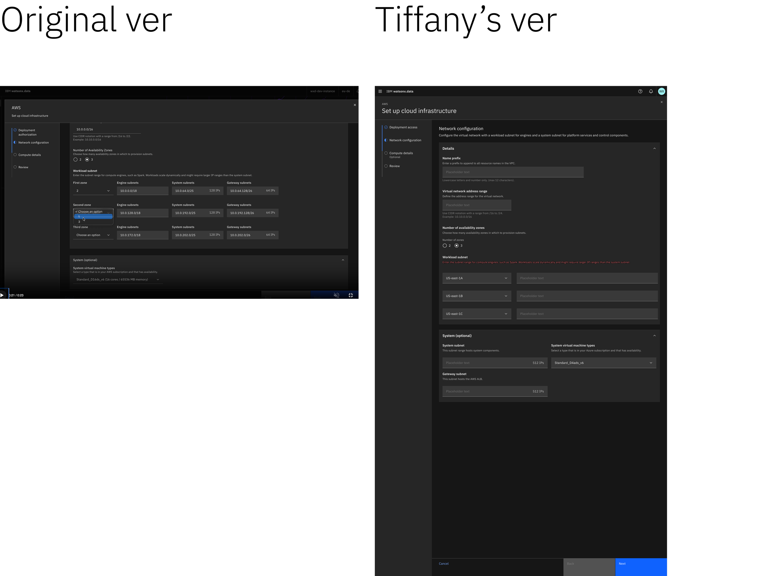
The left side shows the original version and the work-in-progress version created by my teammate, Tiffany. After she left the team, I took over the project and was asked to address the issues identified by the PM in the original design video. These included reducing visual complexity, simplifying the workflow, improving readability, correcting layout, color, and typography issues, and aligning the design with IBM standards. While the handoff version provided a useful foundation and reference, it required further refinement to better meet usability and design requirements.
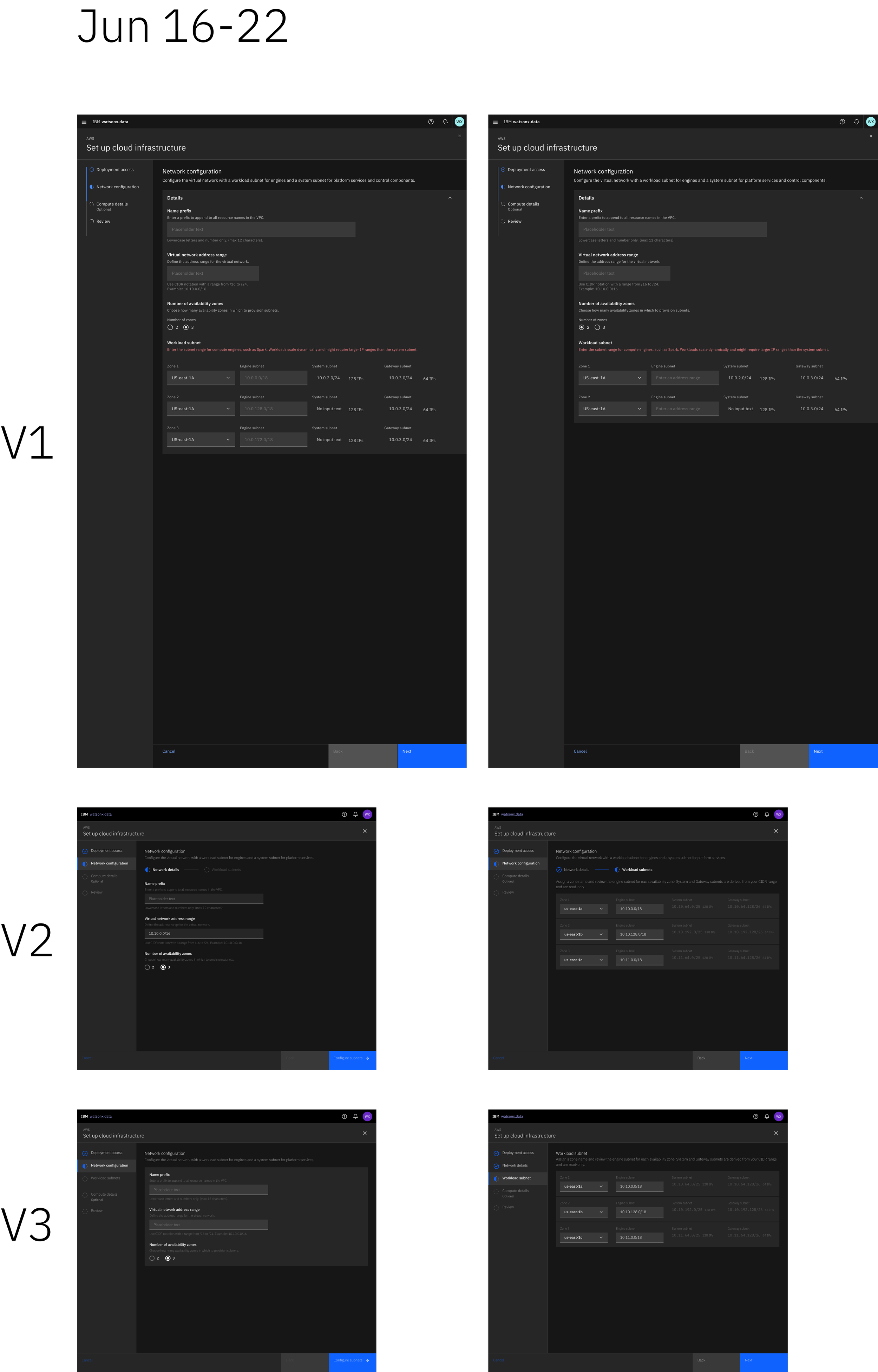
In the second version, I explored a cleaner layout by separating the page into distinct sections rather than grouping everything together. This approach was ultimately not adopted because Set Up Cloud Infrastructure already contained many granular steps that could not be meaningfully divided further. However, this approach can work well for workflows with fewer steps. I also introduced greater visual consistency across the design, including standardized typography and input-field colors.