Workbench Run Script
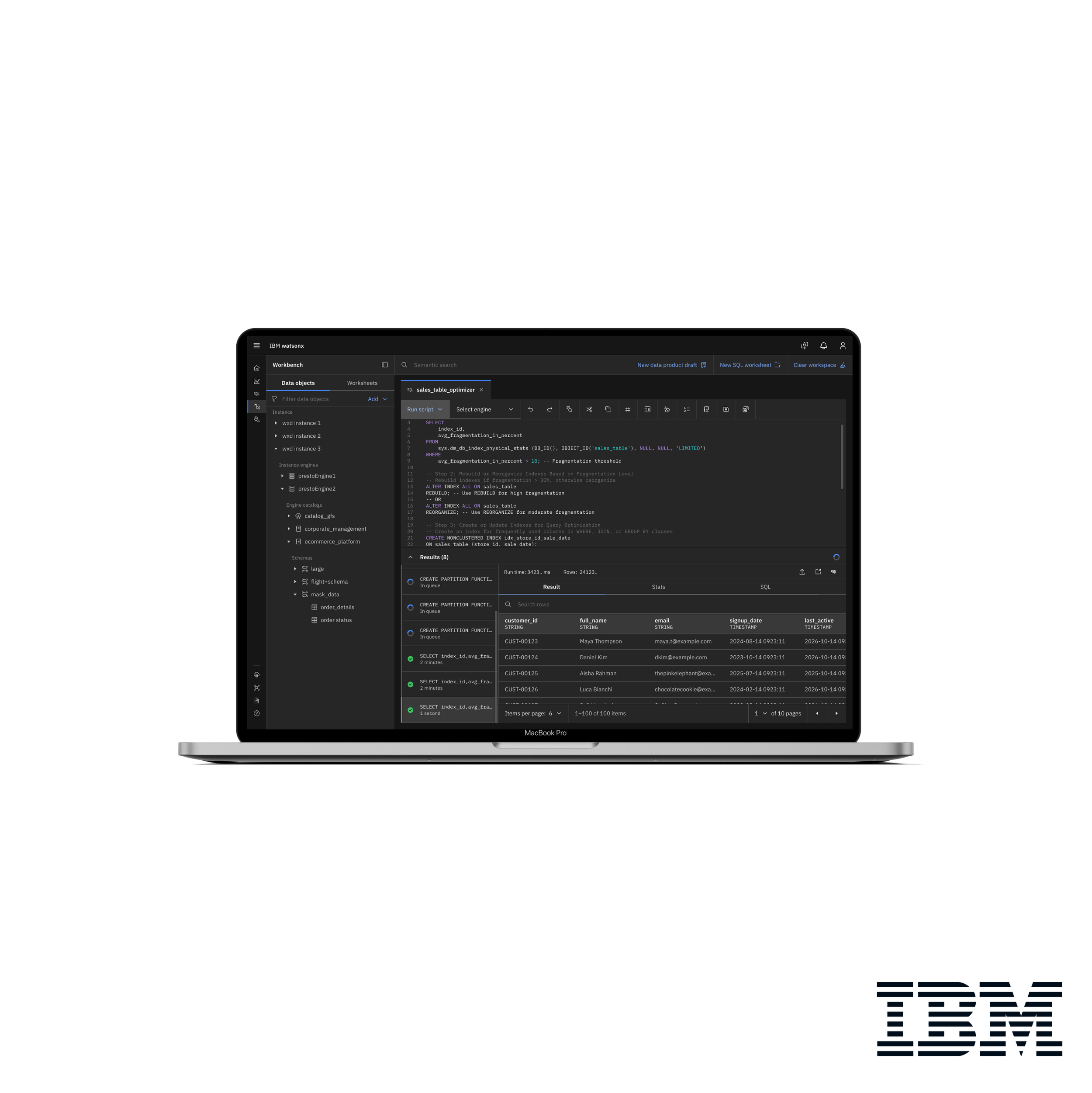
Running scripts in an enterprise data platform involves multiple states, results, and system responses that can make the workflow difficult to follow. During my internship on the IBM watsonx.data team, I redesigned the Run Script experience in Workbench to make script execution and results easier to understand and navigate.
The project focused on improving the result hierarchy, simplifying loading states, and creating a clearer end-to-end workflow while providing detailed interaction specifications for engineering implementation.
Product: IBM watsonx.data
Tool: Figma
Focus: Enterprise UX · Workflow Design · Interaction Design · Design–Engineering Collaboration
Team:
1 Design Lead
2 Designers
3 Software Engineers
1 Product Manager
My Area of Responsibility
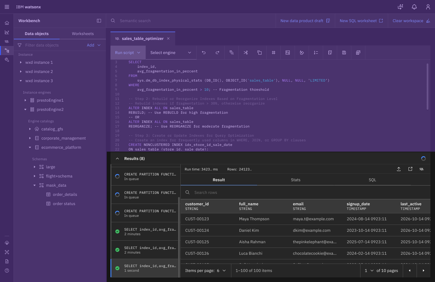
My primary responsibility was to define how the interface changes when users click Run Script multiple times. I documented each interaction and its resulting state, supported by a detailed prototype showing the exact appearance of the page after every action. My work focused specifically on the non-purple area of the interface, a small portion of the overall page.
Prototype
The following shows my design result and iterations:
My primary responsibility was to define how the interface changes when users click Run Script multiple times. I documented each interaction and its resulting state, supported by a detailed prototype showing the exact appearance of the page after every action.
When a user opens Workbench and runs a script for the first time, the results panel automatically expands from the bottom in a loading state. Each subsequent run adds new query results, with the most recent result appearing at the top and the earliest at the bottom. When a worksheet contains multiple statements, each statement is displayed as a separate query result, allowing completed queries to remain visible while others are still in progress. If the user selects a specific result, that result remains within the visible area as new results are added; instead of being pushed out of view, it is gradually moved toward the bottom of the visible area. The user can recognize that new results are being added through the scrollbar on the right, which becomes progressively shorter as the content grows. This provides clear visual feedback without disrupting the result the user is currently viewing.