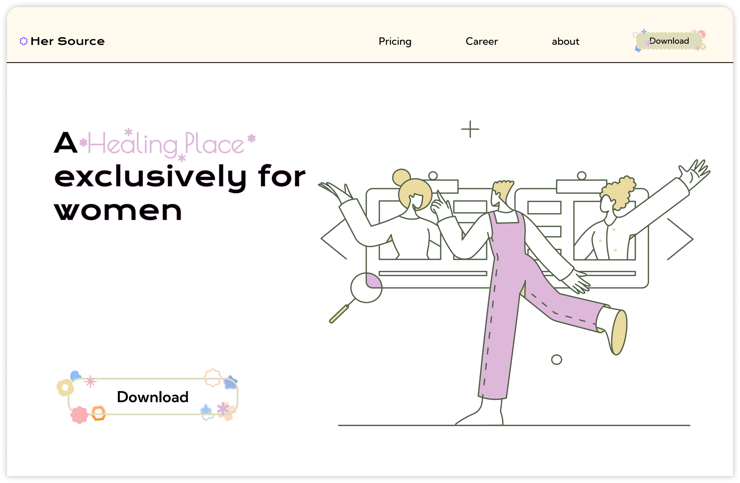
Landing page for a community app, with warm, smart, and uplifting design. With soft pastel colors and playful illustrations, our page creates a safe and approachable space for women. Clear structure and thoughtful visuals keep everything simple yet powerful—showcasing a community that is friendly, inspiring, and empowering.


Her Source is a forum app designed to empower women’s communities. Its mission is to foster meaningful connections, encourage experience sharing, and spark positive discussions—while ensuring the platform remains a safe space primarily for women. The app emphasizes creative and collaborative features, which serve as key areas of exploration and innovation. At present, the project is focused on women in China as its core audience.

Early State
The structural layout of a landing page is no longer the main challenge, as its framework has already been widely standardized. For this project, I intentionally adopted a traditional structure to ensure clarity and familiarity, allowing the design focus to be placed on visual identity, emotional tone, and user experience.

Intro
About
Feature
Pricing
Feature2
Special Feature
People
Job
Contact

Color Selection
The color palette is built on soft pastels such as light pink, lavender, beige, and pale green. These tones were selected to create a sense of warmth, inclusivity, and calmness, while avoiding the harshness of strong contrasts. Pink and lavender subtly convey femininity and empathy, beige provides balance and simplicity, and pale green introduces freshness and vitality. Together, they reflect the brand values of a women-centered community—gentle yet empowering, approachable yet modern.

Healing Place: I used a unique font and color scheme. Purple is a neutral color, highlighting integrity and inclusiveness, while the unique font "Healing Place" emphasizes relaxation and joy.
Download: Exquisite and lovely details entice users to click.
Horizontal Line Design: Embodying a subtle retro feel and a friendly feel, adding vitality to the website.
Orange Line: This also complements the retro feel.
Rectangular Overlay Illustration: Adds transparency and a sense of depth to the website design.
The blue button, combined with the orange, creates a retro and friendly feel for the homepage.
The use of different shapes creates a lively and modern feel.
Design Concept
Conclusion
Illustration Selection: The illustrations don't feature prominent characters or facial close-ups. This emphasizes the concept of inclusiveness. The green color conveys the project's approachability.
Illustration Color: I added a touch of pink to create a gentle feel.
Button Color Design: The variety of colors increases as the level increases, allowing users to understand the progression from low to high without having to read the text.
Orange Highlight: Using orange not only emphasizes the importance of text but also adds a sense of vitality.
Join Us: The delicate and charming details reduce the tension of the content and create a warm atmosphere.
the UI design successfully communicates friendliness, wisdom, vitality, and simplicity, aligning with the identity of a women-centered forum app. The interface blends traditional landing page structure with a thoughtful color palette and expressive illustrations, resulting in a design that feels both familiar and distinctive.
The use of illustrations plays a central role in the UI design. Hand-drawn, abstract human figures express liveliness and diversity, echoing the community’s values of openness and empowerment. Instead of overwhelming realism, the illustration style balances playfulness and sophistication, making the page approachable while still maintaining credibility.
The typography and layout are straightforward, with concise text and clear hierarchy, ensuring readability across devices. Calls-to-action use gentle yet noticeable contrast, guiding users without breaking the overall softness of the page.